
RecycLA
The city of Los Angeles rolled out a new recycling program called recycLA. The city extended recycling opportunities to businesses, institutions and large multi-family buildings by providing blue bins.
Our team was tasked with finding a digital solution to help consumers understand what can and cannot be recycled and help them act upon it to reduce landfill waste in Los Angeles.
RESEARCH
Competitors
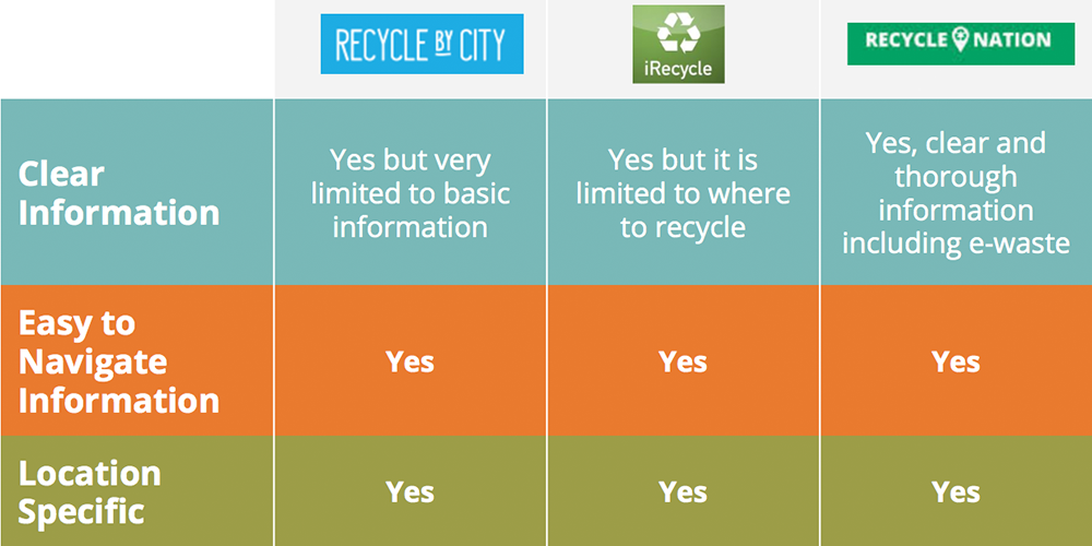
We started our research phase by making assumptions about possible users. I conducted a comparative and competitive analysis by looking at similar mobile apps and websites and taking note of their learnability, efficiency, memorability, error handling, and user satisfaction. We compared these results to the recycling section of the current department of public works website.
86%
Recycle at home
Respondents who said they recycle at home
72%%
Altruistic Motivations
Respondents with empathy and value-based motivations for recycling
64%
Taught vs. Sought
Respondents who were taught to recycle either at home, school, or via media
93%%
Search Online
Respondents who would first search online to find information about recycling
User Research
Based on our assumptions, our team targetted two user groups for in-person interviews, LA residents who recycle and those who don’t. After interviewing 8 individuals, all of which said they recycle, we realized people may not feel comfortable admitting they do not recycle in-person. We created an anonymous survey and posted it to Los Angeles social media groups. We received 51 responses.
We looked deeper to understand why they recycled, where they learned to recycle, and where they would go to find information about recycling.
Problems
We then looked at the users who said they did not recycle and identified the following points of friction; users feel the system needs improvement, the process of recycling is not convenient, information on recycling is confusing, and there is not enough room or containers to do so.
DATA SYNTHESIS
Persona 1
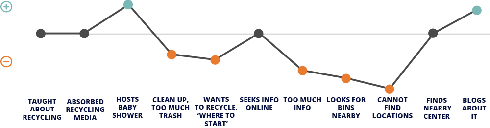
We used our user research to develop two user personas. Our primary is Samantha, a West LA social justice warrior with value-based motivations for recycling.

Persona 1
We created a scenario and journey map resulting in Samantha overcoming difficulties and recycling the plastic bottles she had left over from a baby shower she hosted. She is very frustrated with the information she finds but she ultimately achieves her goal and recycles her goods regardless.
Persona 2
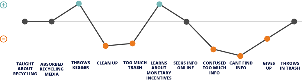
This is Alex, our second persona. Alex, has more ego-based motivations for recycling and is interested in the monetary incentives.
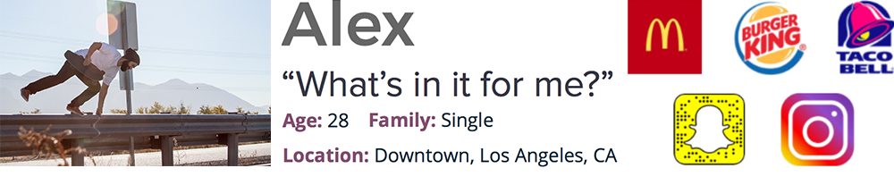
Persona 2
He, similar to Samantha, hosts a party and is left with lots of trash. He plans on throwing it all away but his friend lets him know he can exchange some of the materials for money. He ended his scenario and customer journey map by becoming frustrated and deciding the money he could make was not worth the trouble of recycling.
IDEATION
Feature Prioritization
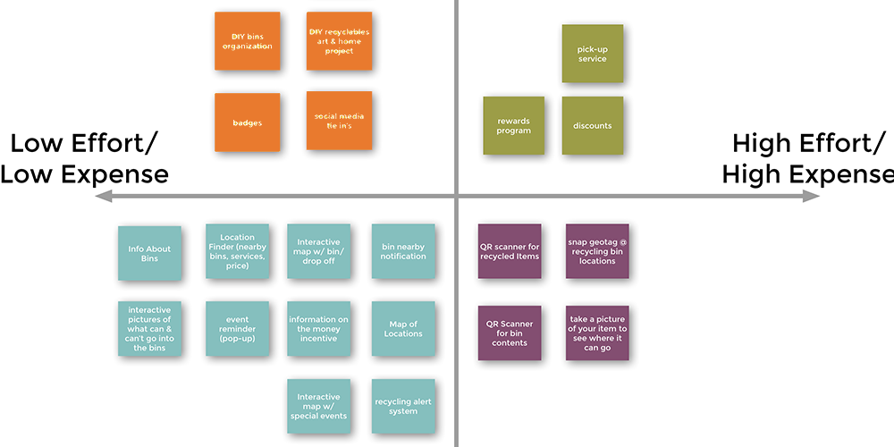
Our team then used our personas and scenarios to come up with digital solutions to the identified problems. We compiled all our ideas and prioritized them based on the effort and expense required to create them and evaluated how essential they were.
Minimum Viable Product
From our key features, our team decided on a Minimum Viable Product, a responsive website with
- information about bins
- an interactive map
- information on monetary incentives
We decided on our key experience and talked about the information architecture. I then used this information to sketch out our key screens.
Pivot
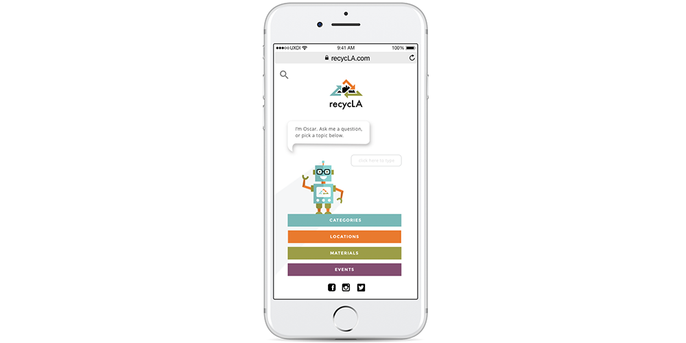
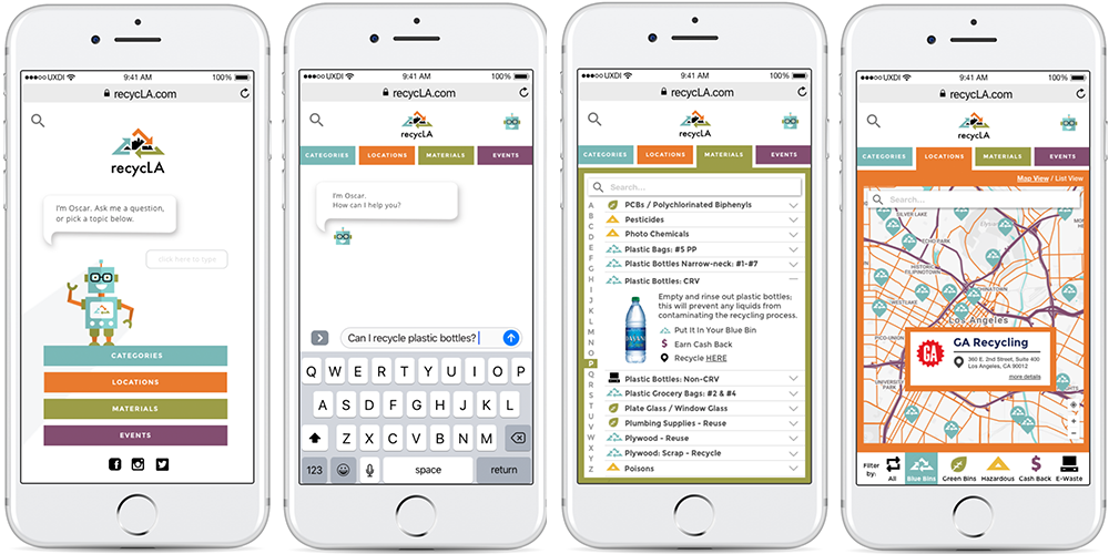
After reviewing the sketches with the team, we realized we may not be leveraging technology as well as we should. We went through our features list again and decided a chatbot would be a relatively inexpensive and simple component to add. After conducting more research into chatbots, we decided to implement it into our existing structure as a way to help people navigate the content of the site.
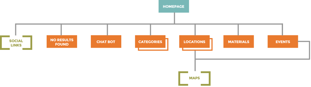
Information Architecture
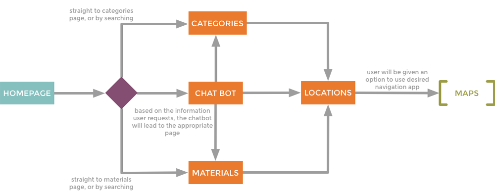
We revised our information architecture and created a site map and task flow to help us identify our key screens.
User Flows
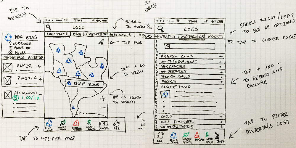
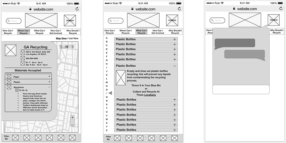
We then turned my sketches into digitized wireframes and mapped out all the components of each of our screens.
BRANDING
Mood Board
Our team created our own mood boards for how we felt the brand should look. Some elements we agreed on were
- flat design
- colorful pallettes
- modern aesthetic
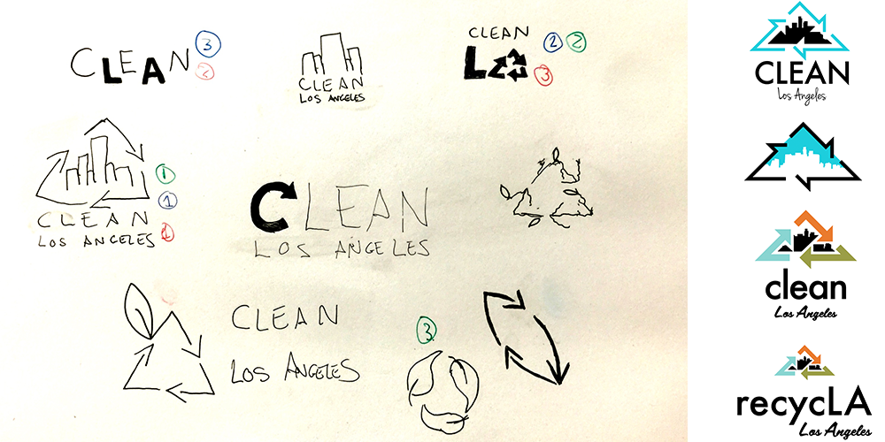
Logo Development
We agreed that our logo should reflect both the idea of recycling along with the city of Los Angeles. I quickly sketched out some logos and each team member ranked their top three picks. We all chose the sketch with the recycling symbol surrounding the LA skyline as our top pick.
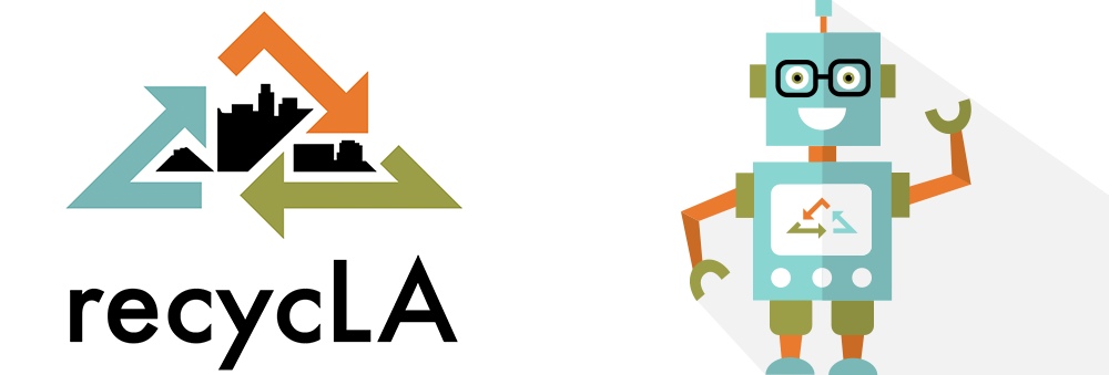
I then developed a few iterations of the sketch in Adobe illustrator and got continuous feedback from my teammates until we had a logo we all agreed on.
Style
I expanded upon the logo colors to create a colorful and versatile color palette. I picked some web safe fonts to match the logo font and illustrated a personified version of our chatbot. We named him Oscar.
PROTOTYPING
User Testing
We built a prototype with our mock ups and tested 5 users. All of our users liked the chatbot but were confused by our taxonomy. Most of our users thought there was too much information overall and suggested some of our pages (like the “why recycle” page) were unnecessary.
Reiteration
Based on our peer and user feedback we made changes to our mock ups, got rid of some of the information, changed our naming conventions from “what, where, why, how, etc.” to straightforward labels like “events” and “bins.” Click below to see our most recent prototype.
NEXT STEPS
Testing and Features
We would definitely like to do more testing on our prototype and depending on the results of the tests we would like to add more features such as
- Account Login for customers to access their city account
- Integrating the chatbot into a messaging platform, i.e. Facebook
- Rewards program to incentivize recycling
- QR Scanner for bin information

Test

Reiterate
